

How to Read a Stock Chart: Candlestick Basics for Beginners
How to read a stock chart is a question that stops most beginners cold the first time they open a trading app and see a screen full of red and green rectangles with lines sticking out of them. It looks intimidating, but the underlying idea is genuinely simple once someone actually walks you through it — a candlestick is just a compact snapshot of a battle between buyers and sellers over a specific stretch of time, and once you can read that one battle, reading a whole chart is just reading many of them in sequence.
We're going to build this up from the single candle outward, using real Indian market examples, so by the end you can look at a Nifty or Sensex chart and actually understand the story it's telling, not just recognize that it exists.
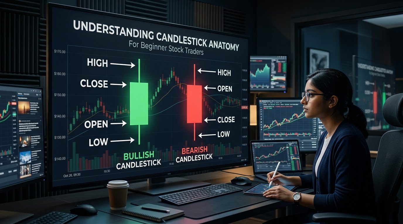
Table of Contents
- The Anatomy of a Single Candlestick
- What the Color Actually Tells You
- Body vs Wick: Two Different Stories
- Real Example: Reading a Reliance Candle
- Three Beginner Patterns Worth Knowing
- Choosing the Right Timeframe
- Reading Candles Against Support and Resistance
- Why You Shouldn't Trade on Candles Alone
- Common Mistakes Beginners Make
- Frequently Asked Questions
The Anatomy of a Single Candlestick
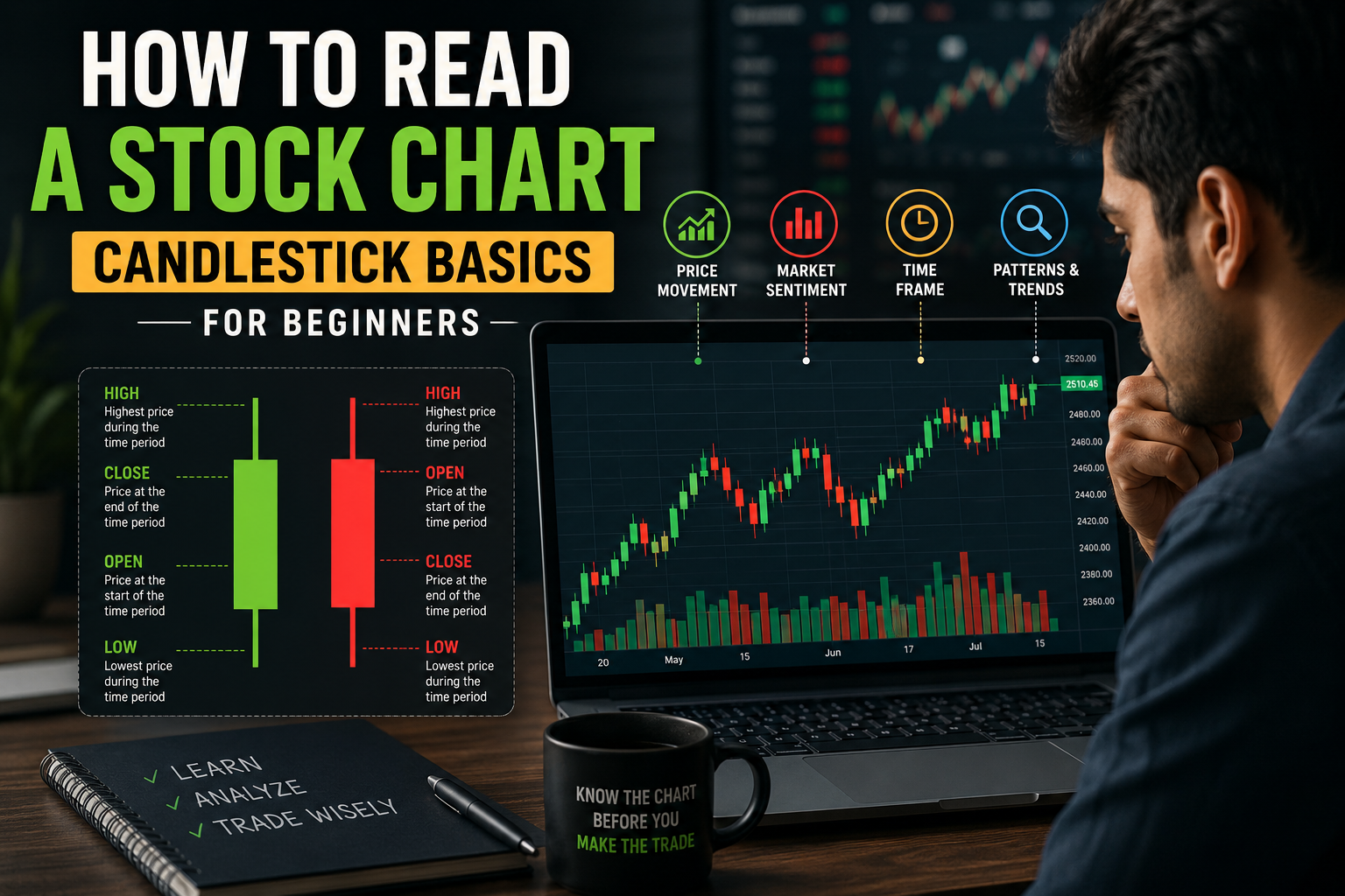
Every single candlestick packs four pieces of price data into one compact shape: the open, high, low, and close for whatever time period that candle represents — a day, an hour, even a few minutes, depending on your chosen timeframe.
A bullish (green) candle: close is above open, meaning buyers won that session.
Whatever platform you use — Zerodha Kite, Upstox Pro, TradingView India — this exact structure stays the same, and once it's memorized, you can read any candlestick chart on any platform without relearning anything.
What the Color Actually Tells You
The color of a candle is the fastest piece of information it gives you. A green (or white/hollow) candle means the closing price was higher than the opening price — buyers were in control during that session. A red (or black/filled) candle means the closing price was lower than the opening price — sellers were in control.
Body vs Wick: Two Different Stories
The body is the thick rectangle — the range between the open and close. A long body signals a strong, decisive move in one direction during that session. A short body signals indecision or a pause, where the open and close ended up close together despite whatever happened in between.
The wicks (also called shadows) are the thin lines sticking out above and below the body. The upper wick shows how high the price got pushed before sellers pulled it back down — a long upper wick hints at supply that capped the rally. The lower wick shows how low buyers were able to push the price before demand stepped back in — a long lower wick hints at hidden buying interest. Long wicks on both sides of a small body usually signal genuine indecision: the market tested a level in both directions but couldn't hold either one.
Quick Reference: What Each Element Signals
| Element | What It Shows |
|---|---|
| Green/white body | Buyers won this session (bullish close) |
| Red/black body | Sellers won this session (bearish close) |
| Long body | Strong, decisive move |
| Short body | Indecision or pause in the trend |
| Long upper wick | Rally attempt was rejected, supply capped price |
| Long lower wick | Sell-off was absorbed, hidden demand present |
Real Example: Reading a Reliance Candle
A Single Day on a Reliance Chart
Say Reliance opens a trading session at ₹1,400, dips down to ₹1,385 during the day as some early selling comes in, then recovers and rallies to close at ₹1,420, with an intraday high of ₹1,425. This candle would be green (close above open), with a fairly long body (₹1,400 to ₹1,420 is a decent move), a short lower wick (down to ₹1,385, showing some early selling that got absorbed), and a tiny upper wick (barely above the close, at ₹1,425). Read together, this single candle tells a story: sellers tried early in the session, buyers stepped in and took control, and the stock finished near its high — a genuinely bullish signal for that session.
This is the exact kind of read that becomes automatic with practice — you stop consciously parsing "open, high, low, close" and start just seeing the story the shape is telling at a glance.
Three Beginner Patterns Worth Knowing
Common Beginner-Friendly Patterns
| Pattern | Shape | What It Suggests |
|---|---|---|
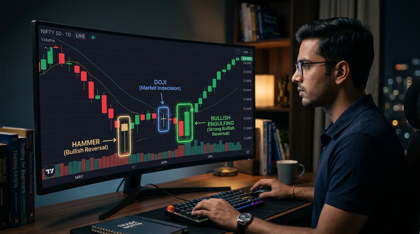
| Doji | Tiny body, long wicks on both sides | Strong indecision, often near a potential turning point |
| Hammer | Small body, long lower wick, little/no upper wick | Sellers pushed down, buyers took back control — potentially bullish |
| Engulfing | A candle's body fully "engulfs" the prior candle's body | A strong potential reversal signal, especially after a clear trend |
A Doji forms when the open and close are nearly identical, leaving almost no body at all — it signals the market genuinely couldn't decide on a direction that session, and often shows up right before a trend pauses or reverses. A Hammer has a small body sitting near the top of the candle's range, with a long lower wick underneath — it suggests sellers pushed the price down during the session, but buyers stepped in forcefully and reclaimed control by the close, often read as a bullish signal, especially after a downtrend. An Engulfing pattern happens when one candle's body completely covers the previous candle's body in the opposite direction — a strong potential reversal signal when it shows up after a clear, established trend.
Choosing the Right Timeframe
The same stock looks completely different depending on which timeframe you're viewing — a 5-minute chart shows dozens of candles for a single trading session, useful for intraday decisions, while a daily chart compresses each full session into one candle, better suited for swing or positional views, and a weekly or monthly chart is what long-term investors typically use to spot the bigger picture trend.
Timeframe by Trading Style
| Style | Typical Timeframe |
|---|---|
| Intraday trading | 5-minute, 15-minute charts |
| Swing trading | Daily charts |
| Positional trading | Daily to weekly charts |
| Long-term investing | Weekly to monthly charts |
Beginners specifically interested in long-term investing rather than active trading don't need to obsess over candlestick precision the way an intraday trader would — but understanding the basics still helps you avoid mistaking normal short-term noise for a genuine change in a stock's underlying trend.
Reading Candles Against Support and Resistance
Candlestick patterns become considerably more meaningful when read alongside horizontal support and resistance levels, rather than in isolation. A bullish Hammer or Engulfing pattern forming right at a known support zone carries more weight than the same pattern appearing in the middle of nowhere on the chart, since it suggests buyers are defending a level that's already proven significant before.
Combining candle signals with trading volume adds another layer of confirmation — a bullish engulfing pattern on unusually high volume signals genuinely strong conviction behind the move, while the same pattern on thin, below-average volume is a weaker, less reliable signal. This is also where understanding broader sector and market context matters — a single stock's candlestick pattern means less if it's moving completely against the grain of its sector or the overall index trend that day.
Why You Shouldn't Trade on Candles Alone
An Important Caveat
No single candlestick pattern is a guaranteed signal, and treating one as such is one of the most common ways beginners lose money in technical trading. Patterns work best as one input among several — combined with volume, trend context, and broader market conditions — rather than a standalone buy or sell trigger. Even experienced technical analysts treat a single pattern as a probability shift, not a certainty.
Common Mistakes Beginners Make
Watch Out For These
1. Trading a single pattern without any confirmation. Combine candlestick signals with volume and trend context rather than acting on shape alone.
2. Using the wrong timeframe for your actual strategy. An intraday trader analyzing weekly charts (or vice versa) is looking at information that doesn't match their actual holding period.
3. Ignoring where the pattern forms on the chart. The same pattern means far more at a known support or resistance level than in the middle of an unremarkable price range.
4. Overreacting to a single candle. One bearish candle in an otherwise strong uptrend usually isn't a reversal signal — context across multiple candles matters more than any single one.
5. Skipping practice before real capital. Paper trading or reviewing historical charts without real money on the line is a genuinely underused way to build pattern-recognition skill before it costs you anything.
Once candlestick basics feel comfortable, natural next steps include understanding FII vs DII flows that often drive the bigger institutional moves behind these patterns, and our bull market vs bear market guide for reading the broader trend context that individual candles sit within.
It's also worth building a habit of checking candlestick patterns against the broader index, not just the individual stock. If a stock shows a bullish reversal pattern on a day when the overall Nifty or Sensex is falling sharply, that individual signal deserves extra skepticism — stocks rarely move in complete isolation from their broader market, and a pattern that goes against the prevailing tide is statistically less reliable than one confirmed by the wider trend. This is one of several reasons experienced traders rarely make decisions off a single stock's chart without at least glancing at the index and sector context first.
Beginners specifically drawn toward active trading after learning candlesticks should also revisit our trading vs investing comparison and market order vs limit order guide before placing real trades based on chart patterns — reading a candle correctly is only half the picture; knowing how to actually execute the resulting trade decision is the other half, and beginners frequently underinvest their learning time in the execution side relative to the analysis side.
A final, practical tip: most charting platforms let you hover over any candle to see its exact open, high, low, and close values printed as numbers — use this constantly while you're still learning. Reading the shape is the skill you're building, but cross-checking against the actual numbers underneath speeds up the learning curve considerably, and it's a habit that costs nothing beyond a few extra seconds per candle.
Frequently Asked Questions
What does a green candle mean on a stock chart?
A green (or white/hollow) candle means the closing price was higher than the opening price for that period, indicating buyers were in control during that session.
What is the difference between the body and the wick of a candlestick?
The body is the thick rectangle showing the range between open and close prices. The wicks (or shadows) are the thin lines above and below showing the highest and lowest prices reached during that period.
What is a Doji candlestick pattern?
A Doji forms when the open and close prices are nearly identical, leaving almost no body. It signals strong market indecision and often appears near potential trend turning points.
Which timeframe should beginners use to read stock charts?
It depends on your trading style. Long-term investors typically use weekly or monthly charts, swing traders use daily charts, and intraday traders use 5-minute or 15-minute charts.
Can I rely on candlestick patterns alone to make trading decisions?
No. Candlestick patterns should be combined with volume, trend context, and support/resistance levels for more reliable signals, rather than used as standalone buy or sell triggers.
Do candlestick charts work the same way for all Indian stocks and indices?
Yes. The same candlestick reading principles apply across Nifty, Bank Nifty, and individual NSE/BSE stocks, on any trading platform like Zerodha Kite, Upstox, or TradingView.

Pranab Barman is a Financial Educator and Personal Finance Researcher with over 10 years of hands-on experience in stock markets, trading, and investing. Currently enrolled in the CFA Program, he is committed to continuous learning and professional excellence in finance.
As the Founder of PlayWithStock, Pranab covers a wide range of topics including Mutual Funds, SIP, Taxation, Stock Market Basics, and Financial Calculators — with a focus on simplifying complex financial concepts for everyday all investors.
Email: support@playwithstock.com
Website: playwithstock.com
Related posts:
 Micro-Investing Apps for Beginners: A Complete Comparison
 Vodafone Idea Stock 2026: The Complete ₹35,000 Crore Guide
 AI Investing 2026: The Complete India-US Stock Guide
 Nifty July 2026: Will It Hit 24,800? Complete Market Outlook and Stock Guide
 What Is a Bonus Share? The Complete Beginner’s Guide
 What is Nifty Midcap 150? Complete Guide and Should You Invest in 2026
 Term Insurance vs Endowment Plan: Which is Better for Beginners in 2026
 What Is Sector Rotation? A Simple Guide for Indian Investors